.png)
Helping learners start faster, discover relevant content, and stay engaged across web and mobile.
2024 – 2025
Sole Product Designer
I work as the sole Product Designer in a team of five developers. I led the redesign of the platform’s adaptive UX/UI, improving usability and overall user experience.
As Tradimo’s content library grew, learners struggled to understand where to start, how to resume progress, and which courses matched their experience level.
As the sole Product Designer, I led the redesign from problem definition and research to prototyping, testing, and implementation support.
I reorganized the experience around three learner needs: start learning, continue progress, and discover the next relevant activity.
Average task completion time decreased by 30% across selected core journeys during usability testing.
.png)
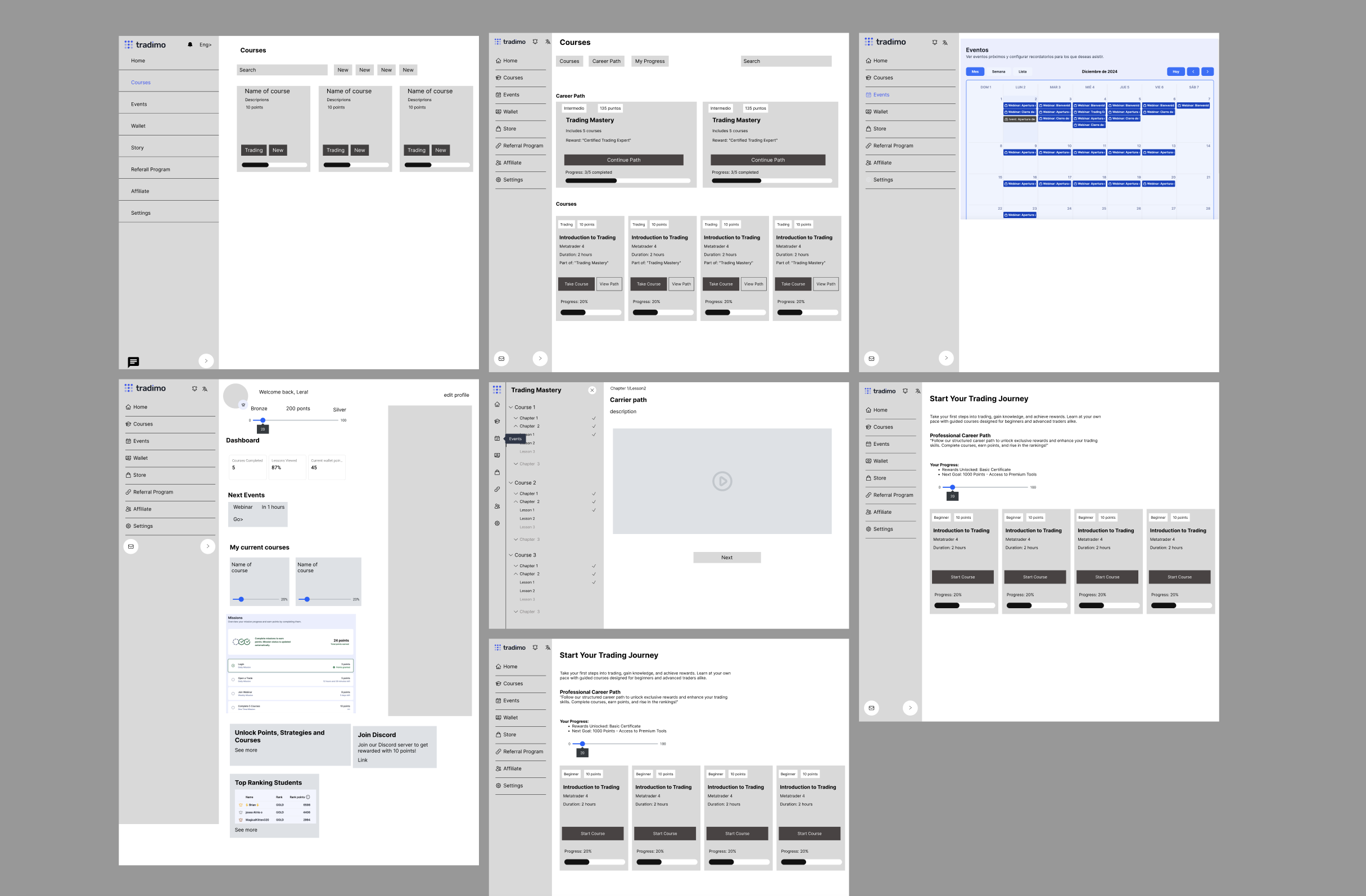
I used an iterative process in which research and testing continuously shaped the final solution.
I combined user interviews, usability sessions, journey mapping, and an interface audit to identify where learners struggled to start, continue, and discover relevant content.

Research revealed two distinct behaviours that required different levels of guidance and speed
The experience needed to guide beginners without slowing down goal-oriented learners.
I mapped the end-to-end learning journey and prioritised opportunities based on user impact and implementation effort.
.png)
The journey map showed that the highest-impact problems were concentrated around activation, discovery, and re-engagement.
I prioritised three connected outcomes:
Start or resume learning faster
Find and evaluate relevant content.
Connect webinars and rewards to progress.
I selected the state-based direction because it balanced guidance for beginners with speed for returning learners.
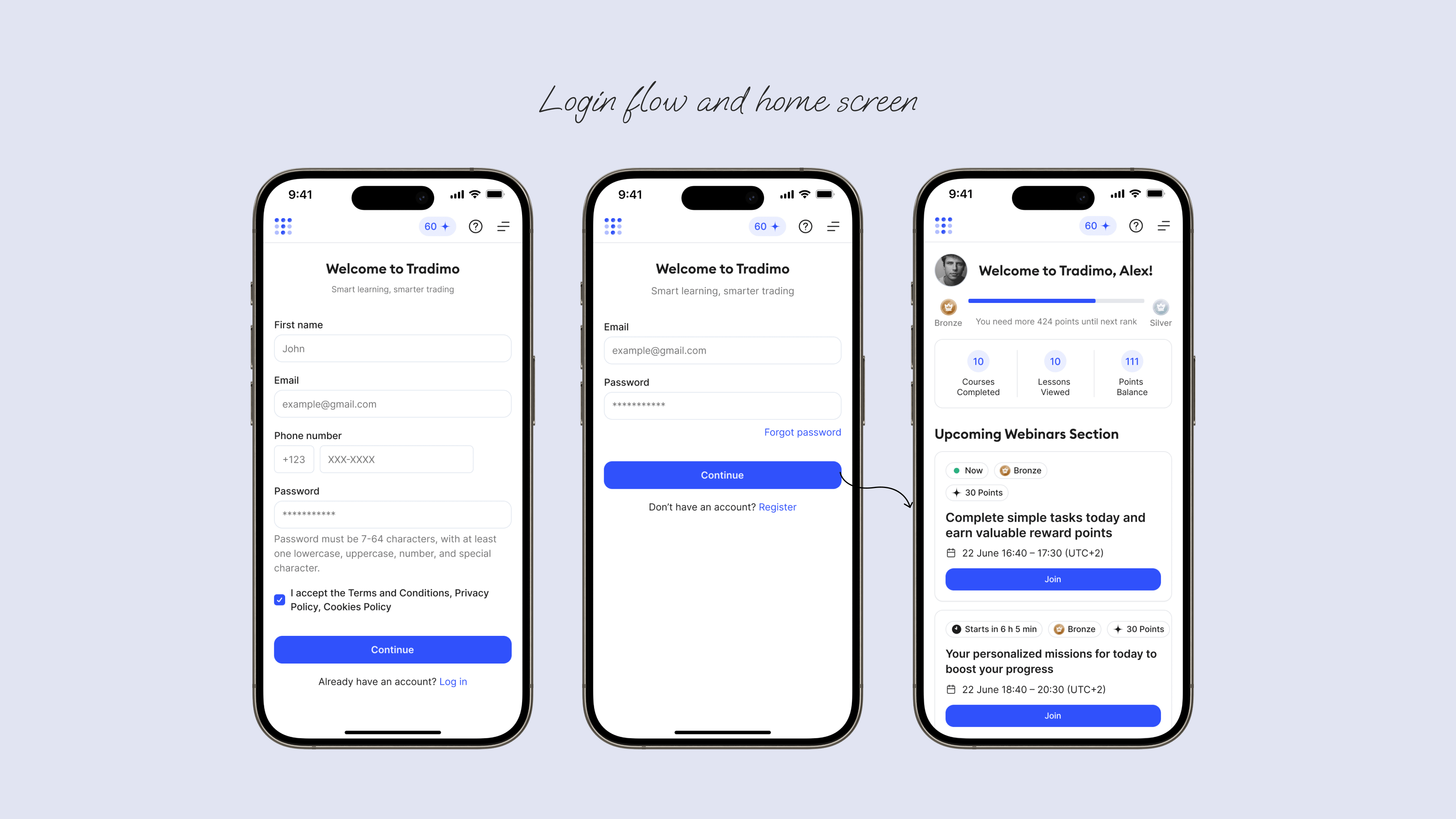
Login flow & home screen
Analytics revealed a steep drop-off before the first lesson. I redesigned the flow to highlight progress and relevant courses, giving each learner a clear next step within one or two clicks.
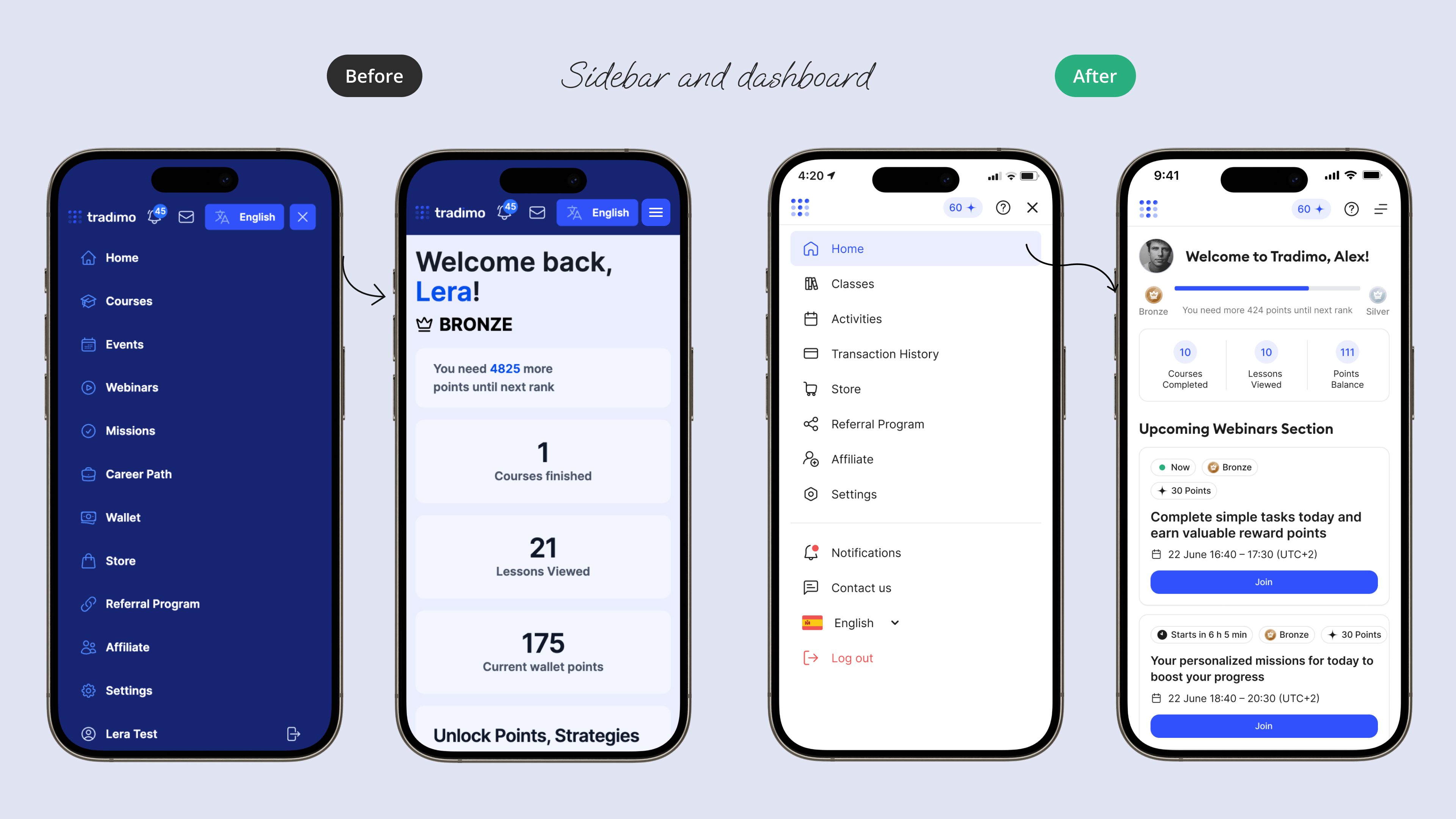
Clearer navigation
I simplified labels and removed redundant paths, adding a dedicated Continue learning entry point for faster access to unfinished lessons.
Better course discovery. We improved filtering and previews so users can quickly assess level, format, and requirements.
.png)
.png)
Clearer course cards
The redesigned card helps learners evaluate course relevance without opening the details page by clearly showing level, rewards, topic, duration, and the next action.
.png)
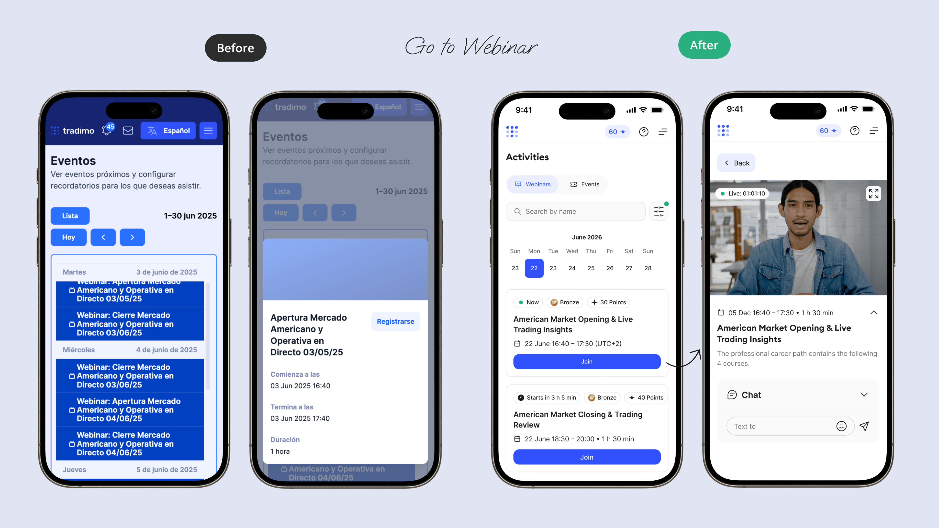
Webinar flow
I unified upcoming and recorded webinars in one place, making it easier to join, set reminders, and rewatch sessions across devices.
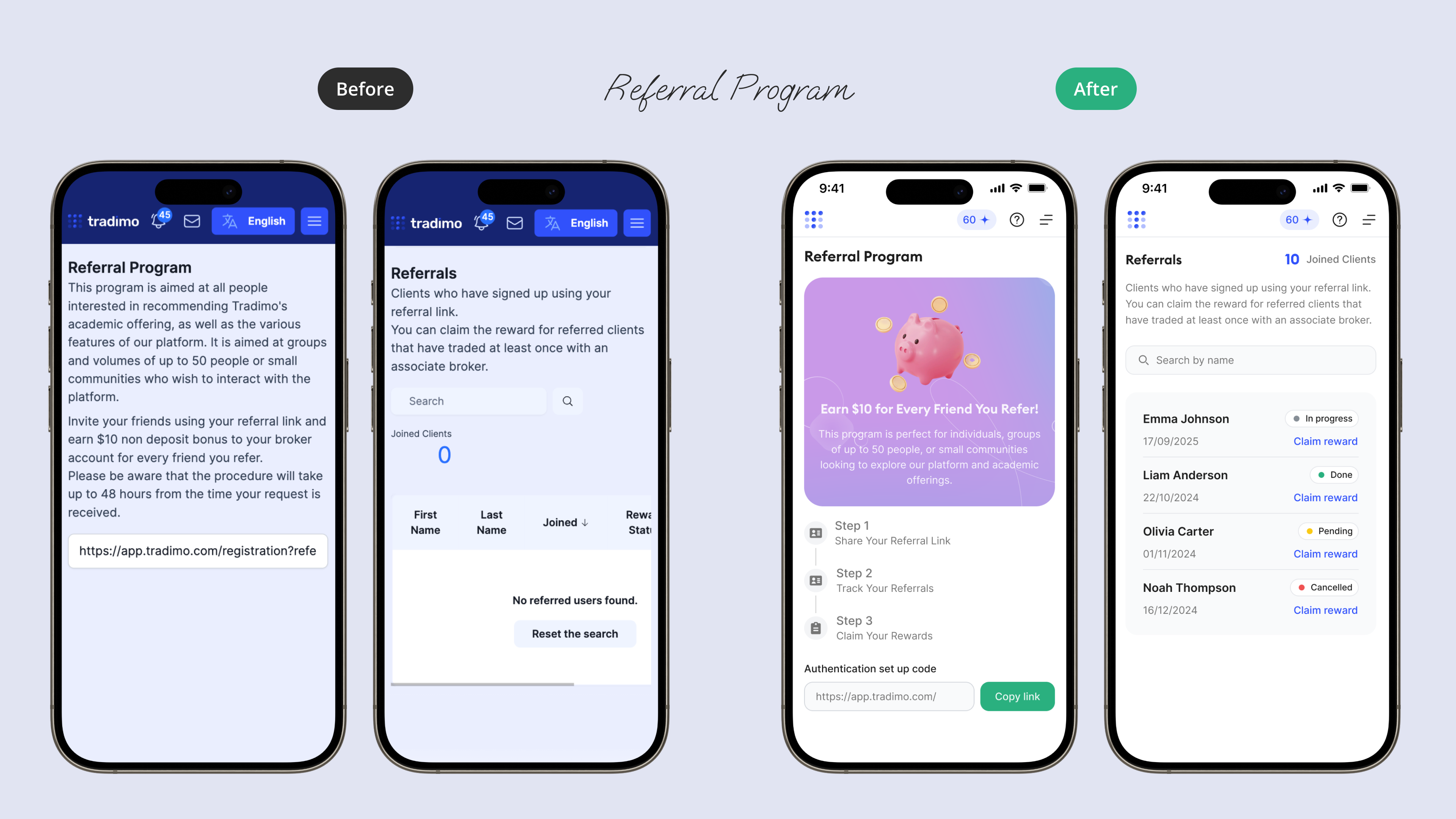
Motivation loops
I surfaced referral and coin rewards after meaningful learning actions, helping them reinforce progress rather than compete with the core experience.
I tested the redesigned core journeys with five participants across desktop and mobile, measuring task success, time on task, navigation errors, and assistance required.

Testing identified three areas for refinement: CTA visibility, course metadata, and mobile filter context.
Average completion time decreased across selected core journeys during usability testing.
Participants relied less on backtracking and required less assistance.
Reusable patterns improved consistency across courses, webinars, and reward flows.
The largest improvement did not come from adding more features. It came from making content, progress, and the next action easier to understand.
With broader access to production analytics, I would next evaluate activation, course continuation, and webinar participation by learner cohort.
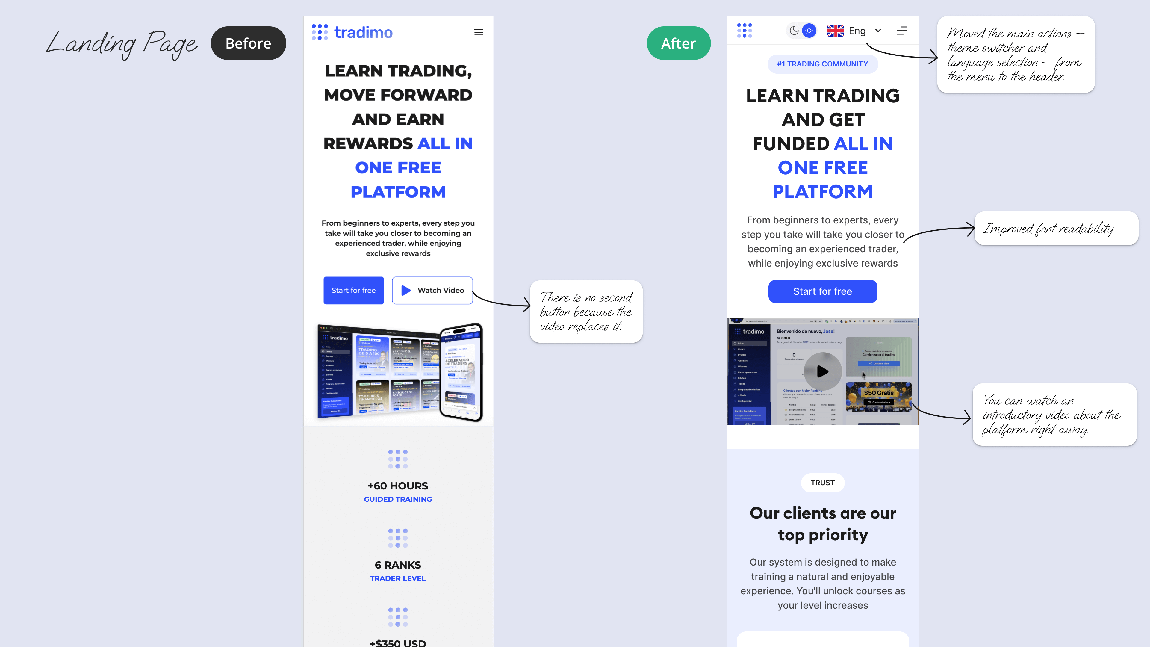
Redesigned a broker’s educational landing page to improve clarity and conversion. I simplified the hero, strengthened the CTA, improved readability, and integrated the introduction video.
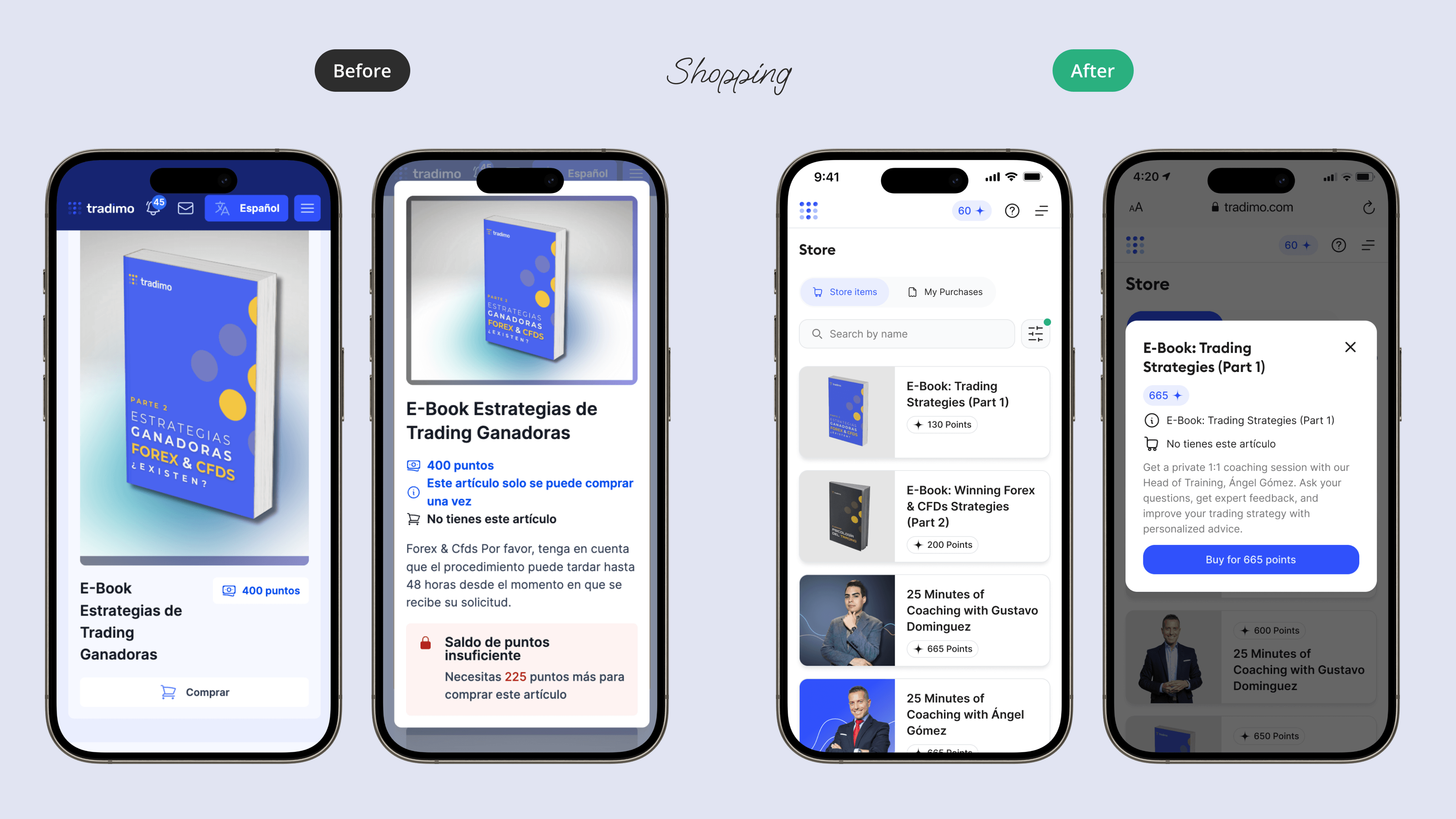
Replaced scattered store pages with a searchable catalog and quick product view, creating a shorter and clearer mobile purchase flow.